


- Product
- Content
- Customers
- Company


WHAT YOU'LL LEARN
- Why showing a product is better than describing it
- How to design a simple A/B test conversion experiment
- How to double down on successful experiments to improve CX
WHAT YOU'LL NEED
- A library of content you can tag to ideal customer personas
- A website personalization platform that connects to your CRM
- A data enrichment tool to help identify key contacts within accounts


THE PROBLEM
The main goal for AlphaSense was to convert visitors on the homepage into a free trial. But their conversion rate could always be improved. When Tommy Culshaw, CRO Manager at the market intelligence platform, investigated, he spotted two key opportunities:
Effectively visualizing the product: AlphaSense consolidates a vast range of insights — company filings, event transcripts, equity research, and so on. How do you help a brand-new visitor visualize it? How do you make them see the value?
Building an engaging free trial experience: With a plain trial signup form, users can struggle to imagine themselves inside the platform.
“Our existing signup page may have been creating unnecessary friction,” Tommy says. “It seemed like a missed opportunity to convert more users.”


THE HYPOTHESIS
Today’s buyers are savvy and skeptical. While they don’t trust audacious marketing claims, they do trust their own eyes. While visitors would scroll past slick CTA straplines, Tommy knew he could hook their attention by showing AlphaSense in action.
His hypothesis was simple: “Product transparency will increase the chance that someone will sign up.”
He planned to embed a product screenshot next to the free trial sign-up form. By giving users a sneak peek of the platform, he planned to pique their interest and generate more free trial requests.


THE SOLUTION
Control vs challenger
Tommy designed a simple A/B test: control form design vs. a challenger variant.
First, take a look at the control.

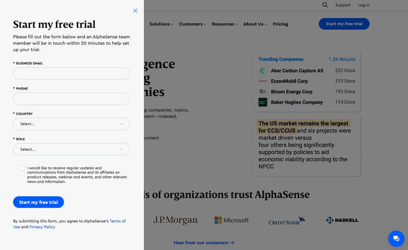
When a visitor clicked “Start my free trial,” the form fired on the left of their screen. The background didn’t change. It remained whatever part of the homepage they were looking at.
Now, take a look at Tommy’s challenger design.

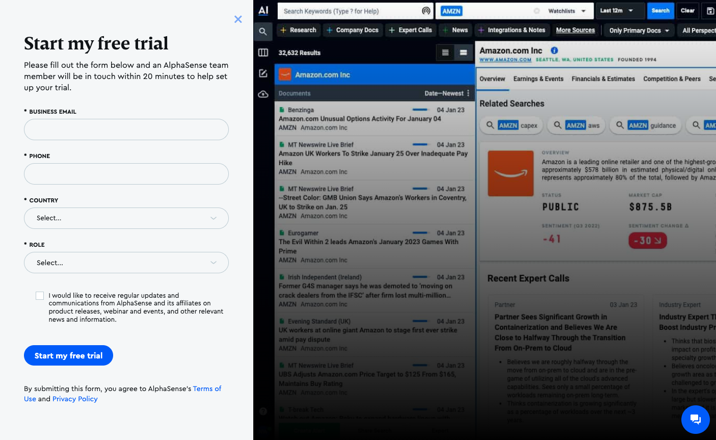
Almost everything is the same — form copy, fields, CTAs. The only difference is the background. Instead of the website, the right-hand panel showed a screenshot from AlphaSense’s product.
It showcased what the platform could do. Do you want to know everything about Amazon? Here’s all the latest news. How are their finances? Check out their earnings reports. Which way is public opinion swaying? Sentiment score change.
“It brings you into the platform,” Tommy explains. “It generates excitement about signing up for that free trial.”
Test, analyze, and scale
Using Mutiny, Tommy tested one against the other. He sent half AlphaSense’s homepage traffic to the control form and half to the challenger.
Instantly, he saw the difference. Conversion rates on the challenger design were higher — much higher. But Tommy is a data guy. He wanted to be sure his experiment was rock solid, so he waited as the visitor count ticked up and his statistical significance crept over the 80% threshold.
As soon as his sample reached statistical significance, he promoted his experiment to 100% of AlphaSense’s traffic. (In case he needed more proof, the statistical significance eventually hit 98%.)
Same strategy, new setting
The experiment proved Tommy’ hunch: buyers wanted to see the product before signing up. But his challenger form design was still a blunt instrument. Pharma VCs, consultancy firms, and in-house market intelligence teams all got the same product screenshot.
It was time to get more granular.
He turned to AlphaSense’s ABM campaign. When target contacts hit the homepage, they already got a personalized homepage, but Tommy began tweaking the form image, too.
“We can show their company name or the contact’s name,” he says. “There's a lot more to be a lot more opportunity there.”
THE IMPACT
From the moment Tommy put his challenger variant live, he could see the improvement. But it was only after three or four weeks that he could quantify the impact.
With an embedded product screenshot, Tommy drove a 73% increase in AlphaSense’s free trial conversion rate.
“This positive outcome demonstrates the importance of understanding your users’ objections and ideating solutions to create a better user experience,” he says.
And this is only the start. Tommy is already thinking about how to deepen the free trial sign-up experience. Personalizing the screenshot — as he did with the ABM campaign — is one option. But a more exciting route is replacing static screenshots with an interactive demo, allowing users not just to see but use, AlphaSense before they sign up.
“It would be awesome to let users just kind of play around with searches,” he says. “It would take this idea to the next level.”
Next playbook
See how Natalie Marcotullio at Navattic used interactive product demos to 5x the number of signups being generated by a product video.


